
TenQ charts combines stock price candlesticks and financial data time series charts to give an intuitive, big-picture overview of a company's performance and stock price.Please use it as a screening tool for stock issues and as one of the materials for stock investment decisions.
Before going into a complex and detailed stock analysis, you can get a time-series overview of the relationship between a company's business value and its stock price.
Using the TenQ chart will increase your investment power several fold.
Check the correlation between BPS, EPS and stock price in time series.

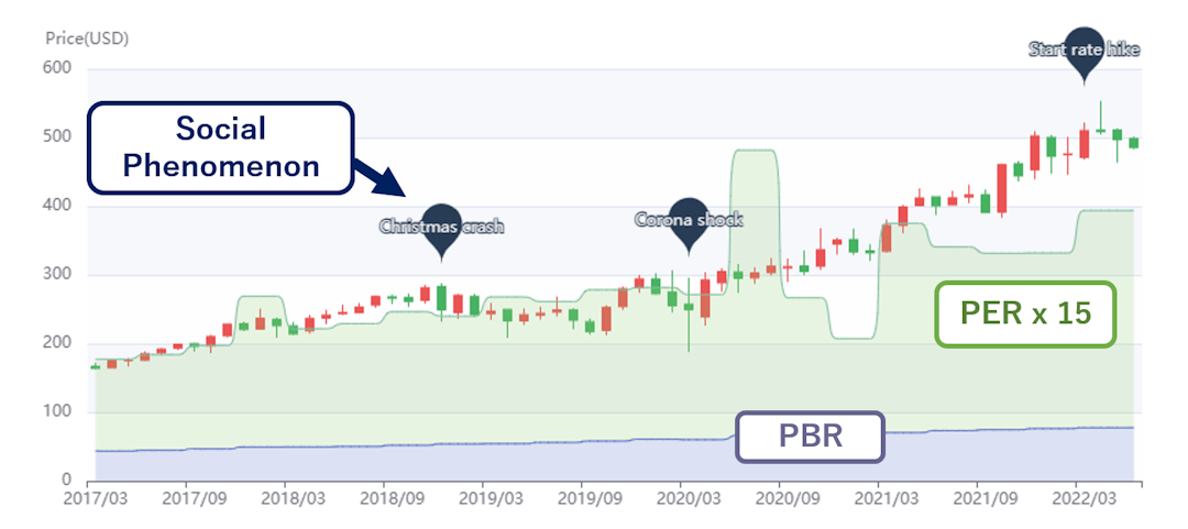
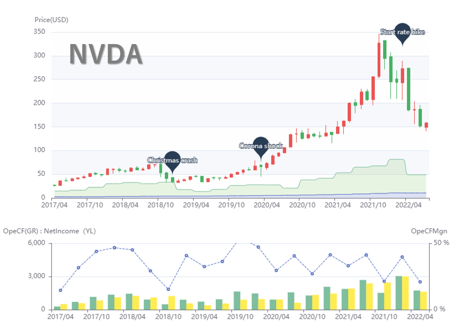
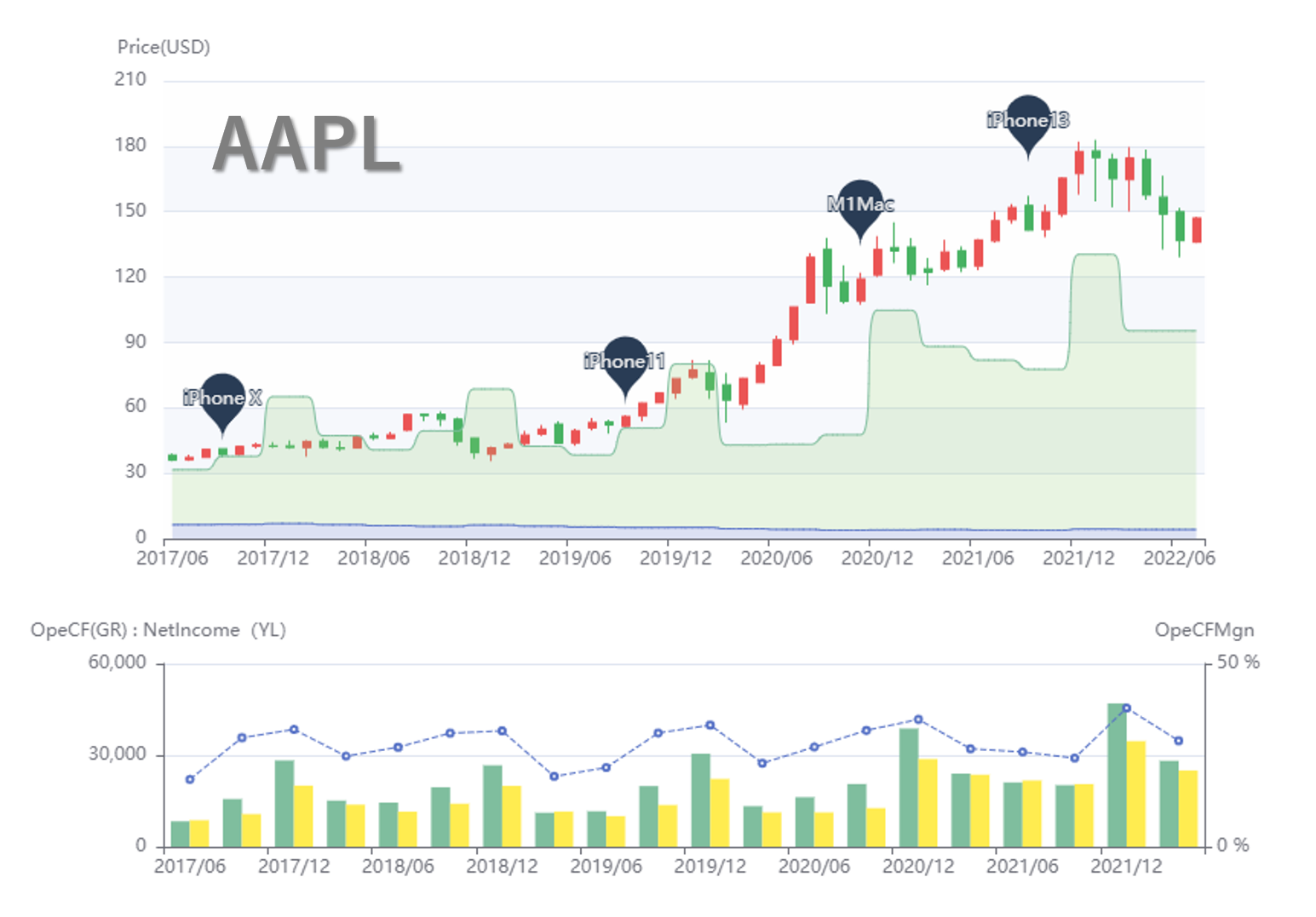
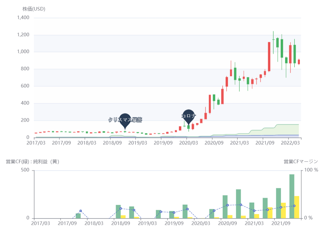
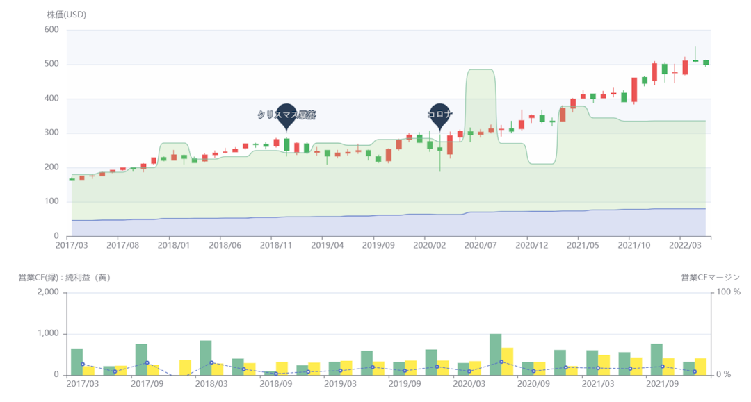
The relationship between BPS, PBR, EPS, PER, and stock price, which are considered important in verifying a company's business performance, are listed in chronological order in an easy-to-understand manner. By comparing the stock price to the "TenQ chart line," the level of the sum of BPS and EPS times 15 (PER 15x), you can intuitively understand the gap between the current stock price and the company's business and asset value. In addition, a marker display has been added to the stock chart to indicate important social events, such as the start of an interest rate hike. This enables an accurate understanding of stock price trends based on the relationship between a company's performance and social events, and provides easy-to-understand, high-quality information for optimal investment decisions.
Operating cash flow margin, operating cash flow and net income in chronological order.

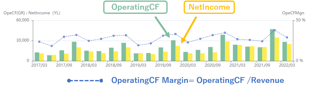
The report provides an easy-to-understand overview of operating cash flow, operating cash flow margin (operating cash flow/sales), and operating cash flow vs. net income, all of which are considered important when checking a company's financial performance. The ability to view financial data in chronological order on the same screen as the stock price allows the user to intuitively determine the value of an investment in a stock.
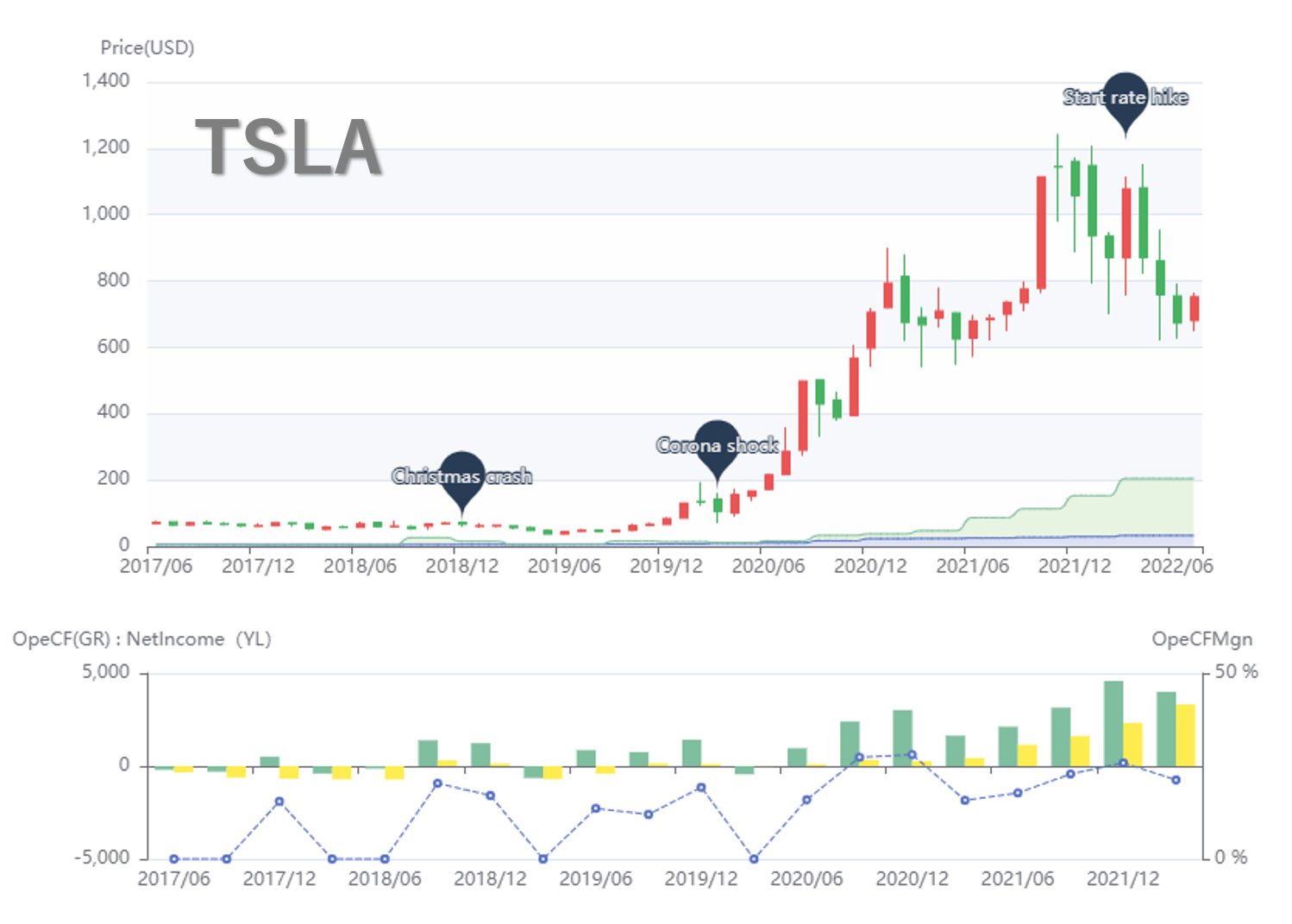
Stock Analysis: Growth Stocks
Tesla[TSLA]
Since 2020, we can see that earnings (sales, cash flow from operating activities, and net income) have been rising at a tremendous rate, lagging the rise in the stock price. Currently, the company is well off the TenQ chart line (BPS+PER*15) and can be considered overbought, but if earnings continue to rise at this rate and earnings catch up with the share price, the share price could rise further ahead of the company. This is a typical growth stock chart.

Stock Analysis : High Dividend value stock
UnitedHealth Group[UNH]
It will be a representative company of the very solid health sector, which is not greatly affected by boom and bust, and steadily accumulates profit (green area) and net assets (blue area). Although the slightly low operating cash flow margin is a concern, the relationship between operating cash flow (bar chart in green) and net income (bar chart in yellow) is very good, indicating that this is an excellent company with very stable earning power in its core business.

Index Fund (ETF) and Sector Fund (ETF) Comparison and Analysis
If you are interested in index funds and high dividend funds, please see this page for a comparative analysis chart of the funds. A list of the top constituents is provided for each fund. You can also click on the list of top constituents to view TenQ charts for individual stocks.
Index Funds
(U.S. & World Stocks)
Comparative analysis of the growth rates of VOO, VTI, and VT starting at the end of 2014. We will also list the top component stocks.
Go to Index ETFHigh Dividend
stock fund
Comparative analysis of the growth rates of VYG and VYM starting from the end of 2014. We will also list the top component stocks.
Go to Highdividend ETFHealthcare Sector
Comparison and Analysis
We will compare the Health Care Sector Fund and ETF to a market index. It will also list the top constituent stocks.
Go to Health Care ETF